Smart Bill - Layout Sections
The Smart Bill default sections are the sections that are provided by the Bill itself and contain data based on the raw information stored in the ESR or (partially) on the enriched data (e.g. the items or promotions related to the Bill). All sections that work on their own without further configuration are already marked as active. Only the ones that require user configuration (e.g. the feedback or newsletter section) are disabled by default and need to be configured and enabled manually.
Logo
This logo section is used to configure the appearance of the Smart Bill logo. This logo can be different from the Simple Bill version and can explicitly be uploaded in this section.
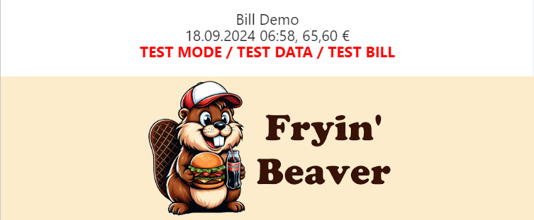
| Option | Function / Effect |
|---|---|
| Image | Allows the upload of an image (up to 500KB) used as the Smart Bill logo. The image will be affected by the other settings. |
| Alternative Text | A text which is shown instead of the image in case the picture cannot be displayed. |
| Alignment Options | Allows the alignment of the logo image within the Bill layout. |
| URL / Mailto | An optional URL to be accessed when the logo is clicked. Alternatively, it can also be designed as maito:<EMAILADDRESS>. |
| Height / Maximum Height | Controls the behavior of the logo's height. Height specifies the desired height of the image, but the maximum height limits this (e.g. not to extend beyond the limits of the document). Specification possible in pixels or percent |
| Width / Maximum Width | Similarly to height, behavior of the width can be configured. Both values (height and width) should match each other as to not generate a distorted image. |
Summary
The summary is a small section that indicates the number of items on the Bill and shows the receipt number. Texts can be changed to fit the companie's corporate identity.
| Option | Function / Effect |
|---|---|
| Summary | Defines the label shown at the top corner of the section. Can be used to customize on of the first texts typically shown on the bill |
| Transaction-No. | The label used for the transaction number. |
| Item (singular) | In case only a single item is present on the Smart Bill, the singular version of the label will be used |
| Item (plural) | For multiple positions / items on the Smart Bill, the plural label version will be used. |
Positions
The positions section is the most central part of the Smart Bill. With its various options, the behavior and appearance can be changed in many ways and allows for quite a custom look. Additional information (added via imports) allows enriching the details of each item represented in a position.
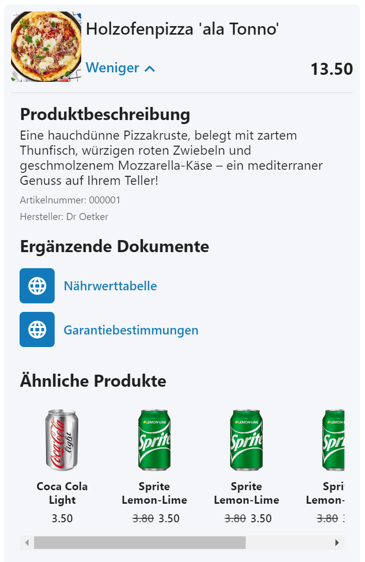
| Option | Function / Effect |
|---|---|
| Product URL Usage | Controls the placement of the product URL (if available). It can be turned off (not showing any clickable link at all) or placed on either the image or in the details as dedicated link. |
| Design | The design for a single position entry. Currently the options "small" and "large" are available, changing the way the (collapsed) overview of that position is rendered. |
| Show Product Name in Single Line | Available only if "small" design is chosen. Prevents the name of the product from wrapping in multiple lines and only shows it in a single line (with text ellipsis enabled, adding '...' in case the name has been shortened.) |
| Highlight Discount Positions | If selected, discount positions (Pos.Amt is less than 0) will be highlighted in green, making them easier to identify. |
| Enable Additional Details | If enabled, the position can be expanded and all available details of the position item will be shown. All following options are dependent on this one being enabled. In case no item data has been provided, no details can be shown and it is recommended to disable the details entirely to avoid confusion. |
| 'More' Label | The label used when the details are collapsed and can be expanded. |
| 'Less' Label | The label used when the details are expanded and can be collapsed. |
| Product URL Label | In case the product URL was set to be used in the details, this label will be shown in the list of additional URLs. |
| Product Description Label | The heading label used for the detailed description of the item (if available). |
| Product Number Label | The small label used for the item / product number shown below the description. Can be disabled entirely. |
| Product Manufacturer Label | The small label used for the item / product manufacturer shown below the description. Can be disabled entirely. |
| Additional URLs Label | The heading label used for additional links as part of the detail (if any are available). Can be disabled entirely. |
| Recommendations Label | The heading label used for potential recommendations (if any are available) as part of the detail. Can be disabled entirely. |
| Ratings for Recommendations | In case recommendations are available and enabled, the ratings (if available) can be turned on or of this way. |
Payment Details
As the name suggest, the payment details section is showing information about the payment process, like the paid amount per payment type, the transaction date and the cashier (if available). If the payment (identified by the description or group information of the payment array entry) can be identified as a specific type, the label and the icon will be changed accordingly automatically. This section can be collapsed or expanded.
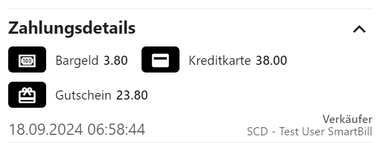
| Option | Function / Effect |
|---|---|
| Payment Area Title Label | The label used as the title for the section, visible even in collapsed state of the section. |
| Cashier or Salesperson Label | The label used for the cashier (if available) shown at the bottom of the section (in expanded state). |
| Open Automatically | If enabled, the section will be opened automatically once a Smart Bill is opened. |
| Show Icons | If enabled, the Smart Bill will try to identify the payment and find correct icons for this payment positions. |
| Show Descriptions | If enabled, the Smart Bill will try to identify the payment type used and change the description / label shown for this position. |
Tax Information
This section shows all relevant information about the available taxes on the bill as provided in ESR.TaxA. The content section is dependent
on the country as the tax groups, percentages and so on vary for each country. These options allow for changing the labels of each part including
the title label of the section itself.

Total
The total section shows the total amount (as provided in ESR.T in the raw data). The options allow to change the label as well as the
size and weight of the text shown.
Customer Feedback
The customer feedback section enables the end customer to give valuable feedback about the shopping experience, the company and/or the digital receipt. Feedback received that way is available in the corresponding feedback view in the efsta Digital Receipt management and can be reviewed and exported (see feedback documentation for more details). The options allow selection of texts and icons used and allow to enable or disable comments, allowing for only ratings, or ratings and comments to be posted by the end customers.
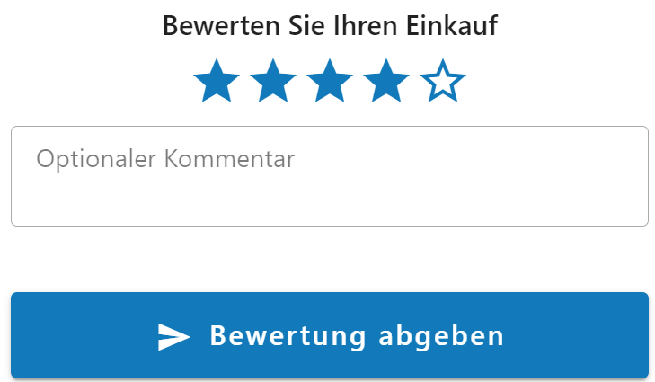
| Option | Function / Effect |
|---|---|
| Feedback Title Label | The title used for the heading of the section, displayed above the rating icons. |
| Feedback Icon Type | The type of icon to use for the actual rating of the feedback. |
| Enable Comments | If selected, the customer is allowed to add a comment in text form to the feedback. The comment area will become available. |
| Comment Label | The label used for the comment (as a watermark in the empty box). |
| Success Label | In case the feedback has been submitted successfully, this message will be shown in a green notification toast at the bottom of the application. |
| Submit Label | The label displayed on the submit button to indicate that this is used to save the feedback. |
| Submit Icon | The type of icon that will be shown in the submit button before the label text. |
Please be aware that trying to actually send the feedback in the preview will result in an error as the feedback cannot be stored for that bill in the layout editor. However, the behavior of sending a feedback can be tested this way nonetheless.
Newsletter Registration
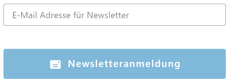
This section can be used to further engage with end customers and allow them to register for the companie's newsletter. There are currently three modes supported for this:
- None / Disabled: Allows configuration of the feature but not unlocking it in order to still hide it for end customers. Can be used to prepare the newsletter section beforehand.
- Open as Link / new Tab: Opens the provided URL in a new tab of the customers web browser. The page has to collect all needed data for registration by itself.
- Open as Link / new Tab & add Email: Also opens the provided URL in a new tab, but enables the user to provide the email address beforehand. The opened URL will receive the email as a query string and can either directly execute the registration (presenting the user with a "success" message) or prefill content on the page instead.
| Option | Function / Effect |
|---|---|
| Newsletter Mode | Defines the mode used for the newsletter registration. See description of the options above. |
| Submit Button Label | The label displayed in the submit button. |
| Submit Button Icon | The icon displayed before the label of the submit button. |
| Newsletter Registration URL | The URL used to redirect to the correct page or API endpoint |
| QueryString for Email | Using the last mode requires the query string to be set. This will define the name of the parameter in the built URL (setting the value to "mail" will result in an URL like https://yourcompany.com/newsletter?mail=user@email.com |
In case an API is targeted by the redirection process (mode "Open as Link / new Tab & add Email") it is advised to still return a proper information text or content that can be displayed to the end user. This way, the end user knows whether the process was a success or not.
Social Media
In order to keep in touch with the end customers, the social media channels of the company can be advertised in this area. Multiple layout options may be chosen to fit the desired design, and labels above and/or below can be configured as well. Currently, the following social media channels are supported: Facebook, X (or Twitter), Instagram, YouTube, LinkedIn, Xing, TikTok

| Option | Function / Effect |
|---|---|
| Top Label | Defines the text shown above the actual social media channel icons. |
| Bottom Label | Defines the text shown below the actual social media channel icons. |
| Channel Icon Design | The design used to display the channel icons. Supported are boxed (icon inside a rectangular box), circle (icon inside a circular box), flat (icon without any container), colorful (actual icons including original colors of each channel is used). |
| Channels | To enable a channel, it has to be selected via check box and a valid URL for that channel has to be set. Note that there is no validation for correct URL and service (aside from the general format of the URL). |
Recommendations
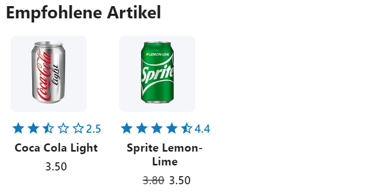
Recommendations are additional items that will be shown based on the imported data (i.e. if item data has been imported that contains recommendations for certain items). If an item on the current bill does have recommendations and the mode of the recommendations is set to either "global" or "everywhere" (see import documentation for more details), they will be shown in this section. Based on the provided information of the recommended items, the appearance can be configured with these options. The section will automatically be hidden in case no recommendations could be found for the current Bill.
| Option | Function / Effect |
|---|---|
| Use Small Version | Defines the mode in which to display the recommendations. When enabled, the tiles (including images and texts) will be rendered in a smaller version, making more tiles visible at the same time while disabling this option will result in more noticeable tiles but less will be visible at the same time. |
| Title Label | Defines the heading label of the section shown above all recommendations. |
| Maximum Number | Limits the number of recommendations shown to the selected number. The items with the most occurrences in the recommendations will be preferred when limiting the list (i.e. if an item A is recommended through item X and Y whereas item B is only recommended through item Z, item A will be prioritized in the list of recommendations). |
| Rating View Mode | The view mode of the ratings allows placing the rating in different areas and ways: "Don't show" (hide ratings completely), "Show icon" (shows only the rating icons), "Show in same line" (shows icons and ratings in the same line), "Show in next line" (shows icons in one and the rating an another line). |
Company Information
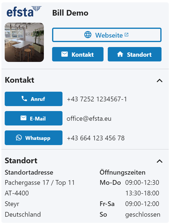
The company information section allows enriching the Smart Bill with additional content related to the location and / or company. This data must be maintained for each location and / or on the company level (see location details). Data includes the address and contact info like phone number and email address, but also information like the opening hours.
| Option | Function / Effect |
|---|---|
| Website Icon | The icon used in the website button of the contact info's top part. |
| Website Label | The label shown on the website button. |
| Location Icon | The icon used in the location button of the contact info's top part. |
| Location Label | The label shown on the location button. |
| Contact Icon | The icon used in the contact button of the contact info's top part. |
| Contact Label | The label shown on the website button. |
| Address Label | The label shown in the location details section for the locations address. |
| Operation Hours Label | The label shown in the location details section for the operation hours of that specific location. |
| Show Operation Hours | Defines whether to show the locations operation hours or not. If disabled, the address is allowed to consume all the available space. |
Promotions
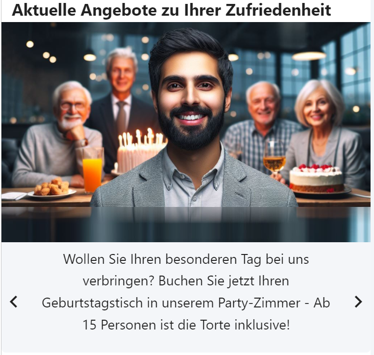
Promotions are another means of interacting with end customers. They allow to inform customers of currently active marketing campaigns or otherwise interesting things. To use promotions, they need to be imported beforehand (see import documentation for details). The options allow for changing their appearance and behavior, as well as limiting the number of promotions shown on the bill. Please note that promotions are (unlike recommendations) not depending on certain items on the Bill and will always be shown as long as they are still valid! Keep in mind that either text or image must be set for a promotion during the import.
| Option | Function / Effect |
|---|---|
| Title | Defines the heading label used as the top-most text of the section. If not provided, it will not be shown at all. |
| Maximum Number of Promotions | Limits the number of promotions which are shown in this section to the given number. The most up-to-date promotions will be prioritized. |
| Show Background | Defines whether the background behind the promotions section should be shown. If disabled, additional text and the control elements will be shown on the default background of the whole bill. |
| Show Paging Information | Defines whether the paging overview will be shown, i.e. an indicator within the section that shows how many promotions have already been shown in the current cycle. This is represented by a line / progressbar. |
| Show Navigation Arrows | Defines whether the navigation arrows should be displayed, allowing manual changing of the promotions by the customer. If disabled, swiping through the promotions on a smartphone is still possible. |
| Cycle through Available Promotions | Defines whether the promotions should automatically be changed after a set period of time and proceed to the next promotion. If disabled, the navigation must be done by the user (either by swiping or using the arrows). |
| Format Additional Text | Provides additional options to format the text of the promotion. It allows changing the position of the text (above or below the image), the alignment of the text as well as font size and weight. |
Custom Sections
Custom sections provide possibilities to further enhance the experience and content on an existing Bill. They can be added and removed as required and contain different ways to transport information or marketing content to the end customer. Please note that the Smart Bill custom sections might have some additional features which are not available for the Simple Bill. Custom sections in general often support dynamic content. After adding a section, the header of the section will contain options to either remove the section or edit its name. Choosing a valid and meaningful name is useful to make it easier to identify the sections content later when working on the layout again.
Custom QR Codes
Additionally to the main QR Code (via ESR.FisCode, if available), more QR codes can be displayed for easier interactions with bill
recipients and end customers. These can refer to further content, for example via URLs or telephone numbers, but can also contain data
for other systems (e.g. payment instructions in banking apps). The contents of the QR codes can either be static fixed texts (one-time
configuration in the receipt layouts) or can also be calculated dynamically using a formula based on the information contained in the ESR
(in order to retrieve customer numbers, receipt numbers, amounts, etc.).
Changes to the QR Code regarding the content are only updated when you leave the field in order to avoid excessive load on the local system due to constant re-rendering of the QR Code. Keep this in mind when designing / configuring the QR code!
| Option | Function / Effect |
|---|---|
| Value | Defines the actual content of the QR Code. This can be entered directly as free text or calculated using a formula. |
| Alternative Text | A text which is shown instead of the QR code in case the latter cannot be displayed. Failure of the QR code rendering should usually only happen if there are problems on the end device, for example if JavaScript is blocked. |
| Size of the QR Code | Depending on the desired appearance, the size of the QR code can be adjusted. Since the QR Code is square, this setting is automatically applied to both width and height. |
| Alignment | This allows the positioning of the QR code to be adjusted. The possible values are 'Centered', 'Left' or 'Right'. By default, the QR code is displayed centered. |
| Colors | If wanted, the border colors of the QR code, the background, and the content itself can be changed. By default, the border is disabled, the background is white and the content is black. |
Barcodes
Similar to QR codes, additional information in the form of a barcode can be added to any part of the receipt. Depending on the intended use, the display and format type of the barcode can be set according to the respective requirements. For example, information for later handling in other systems (e.g. return code for complaints or warranty cases, reference to the receipt itself, and so on) can also be displayed and processed by systems that cannot process QR codes (e.g. due to scanner hardware that is too old).
As with QR codes, a fixed text or a formula can be used for barcodes. Compared to QR codes however, barcodes have the additional restriction that no line breaks may be included, otherwise the code will be invalid. Depending on the used type, other restrictions might apply as well.
The barcode format used also defines which characters and content, as well as any checksums, must be observed. These can be found in the respective format standard.
| Option | Function / Effect |
|---|---|
| Value | Defines the actual content of the barcode. This can be entered directly as free text or calculated using a formula. |
| Alignment | Determines the positioning of the barcode itself. Allowed are 'Centered', 'Left' or 'Right'. |
| Barcode Format | The format to be used for the barcode. Depending on this format, the display of the barcode changes and different characters and content are permitted. |
| Flat Style Display | This setting is only available for EAN8 and EAN13. It controls whether the text is “integrated” into the barcode or displayed directly below it, as with the other formats. |
| Render Value as Text | If set, the value of the barcode is also displayed as text under the barcode for all formats. |
| Text Position | If text is displayed: Controls the positioning of the text in relation to the barcode. Allowed are Top (show above) or Bottom (show below) |
| Text Alignment | If text is displayed: Controls the alignment of the text in relation to the barcode. Allowed are 'Centered', 'Left' or 'Right'. |
| Text Margin | If text is displayed: If specified and not equal to 0, this value will be used as distance between text and barcode. With this feature it is easier to free up the text or to emphasize whether the text belongs to the barcode. The value can also be negative, but this should be used with caution. |
| Height | The desired height of the barcode in pixels. Depending on your preference or the quality of the expected barcode scanner, the barcode can be made larger or smaller. |
| Width | Only two options are avbailable at the moment: Small and Large. Depending on the number of characters displayed, this can be changed accordingly to improve the readability for scanner hardware. |
| Font Family | An optional font used to display the text. |
| Font Size | The optional size to use for the selected font. |
| Background Color | If the barcode should be highlighted or correspond to a CI, the background color can be adjusted with this setting |
| Color of Lines | The lines can also be displayed to match the background color. This must be chosen carefully in combination with the background to ensure good contrast and therefore scanner readability, as well as a fitting appearance in both the light and dark themes of the efsta wallet |
Custom Images
Image Area
Images are used to expand the presentation of information on the receipt. Both static content (.png / .jpg / .jpeg) and animated images (.gif) can be used. It is recommended that the images don't disturb the document too much or distract from the actual content. Images can either be uploaded, provided via fixed URL or a formula can be used to build a URL dynamically (based on the content of the Bill).
| Option | Function / Effect |
|---|---|
| Source | It is possible to choose the type of source for the image. Uploaded images will be stored on the efsta system whereas URLs (both fixed and calculated via formulas) require the company to host it instead. |
| Formula for Showing | To show the image under certain conditions (e.g. if a certain value is set in the ESR), a formula can be used to calculate that condition. In case a value is returned by the formula, the image will be shown. |
| Alternativer Text | A text which is shown instead of the image in case the picture cannot be displayed. |
| URL / Mailto | An optional URL to be accessed when the logo is clicked. Alternatively, it can also be set as maito:EMAILADDRESS. |
| Image Alignment | Defines how to align the image in the layout. |
| Höhe / Maximalhöhe | Controls the behavior of the image's height. It specifies the desired size of the image, but the maximum height limits this (e.g. not to extend beyond the limits of the document). Specification possible in pixels or percent |
| Breite / Maximalbreite | Similarly to the height, the behavior of the width can be configured. Both values (height and width) should match each other as to not generate a distorted image. |
Please note that you must have the necessary rights to the image in order to use it (especially when adding a URL to a system outside your own system's jurisdiction).
It is furthermore prohibited to use images which contain pornographic or otherwise offensive or illegal content.
Custom Texts
Text Area
Text areas can be used to embed additional texts for the current receipt layout in the final receipt. These can be freely defined and can either be the content of an existing field contained in the ESR (e.g. an optionally supplied text) or a fixed text that is the same for all documents. This allows to show certain content on the bill that would otherwise need to be part of the ESR (e.g. in header or footer of the ESR raw content). It is also possible to choose between different styling options that change the appearance and behavior of the text.
| Option | Function / Effect |
|---|---|
| Display Style | Allows to change the overall style of the text. "Full Size" stretches the text through the full width of the bill whereas "in-line" keeps it in line with the other parts (adding some spacing between the border of the Bill and the text). "Scrolling Banner" will change the text to appear as a single line rotation banner instead of a conventional text. |
| Value | The actual value for the text area is defined by this content. It can be a static text as well as a value built via Formulas. |
| Formula for Showing | To show the text under certain conditions (e.g. if a certain value is set in the ESR), a formula can be used to calculate that condition. In case a value is returned by the formula, the text will be shown. |
| Alignment | Defines the alignment of the text within the document. Allowed are Center, Left, Right or Justify. |
| Font Size / Weight | Allows to freely combine the size and weight of the text to appear as desired. |
| Colors | Both font and background color can be changed as needed. Please keep in mind that Bill may be viewed in both light and dark theme, so the colors need to be well visible in both versions! |